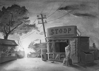
First we have painting.. I purposely desaturated this black and white painting in Photoshop because.. once I added white to make the foreground object opaque, it became all blue. So without unfortunate tints from black and white and the paper colour, I can judge whether I made the tonal work or not better.

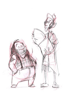
Next, my hobo design. I wonder if they look too generic.. :(
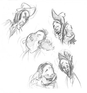
 Playing around with some expression/interactions..
 Zzz.
Zzz.
Sweet tonal, nice work man.
ReplyDelete